Glass,
not boxes
A Vue 3 component library with a dark glass look: translucent surfaces over a rich background, no borders, light used as a signal, and a keyboard-first feel.
| Version | When | Status |
|---|---|---|
v1.4.0 | 2 h ago | Live |
v1.3.9 | yesterday | Replaced |
v1.3.8 | 3 days ago | Failed |
Nothing to set up
# or pnpm, yarn, bun
npm install oyna-ui

// main.ts
import 'oyna-ui/style.css'
import 'oyna-ui/fonts.css'

<!-- any component -->
<OButton variant="primary" hotkey="Enter">
  Save
</OButton>
Installation
No Tailwind, no UnoCSS
One plain stylesheet. No build plugin, no class scanning, no config file to keep in step with ours.
Your colours
Every colour, radius and font is a CSS variable. Change them and the whole library follows.
Open the theme editorAccessibility, not reinvented
The one dependency is Reka UI. It handles focus, the keyboard and screen readers, where there is nothing to look at.
Whole screens
Built only from the library's components. Each one works, and shows its source.
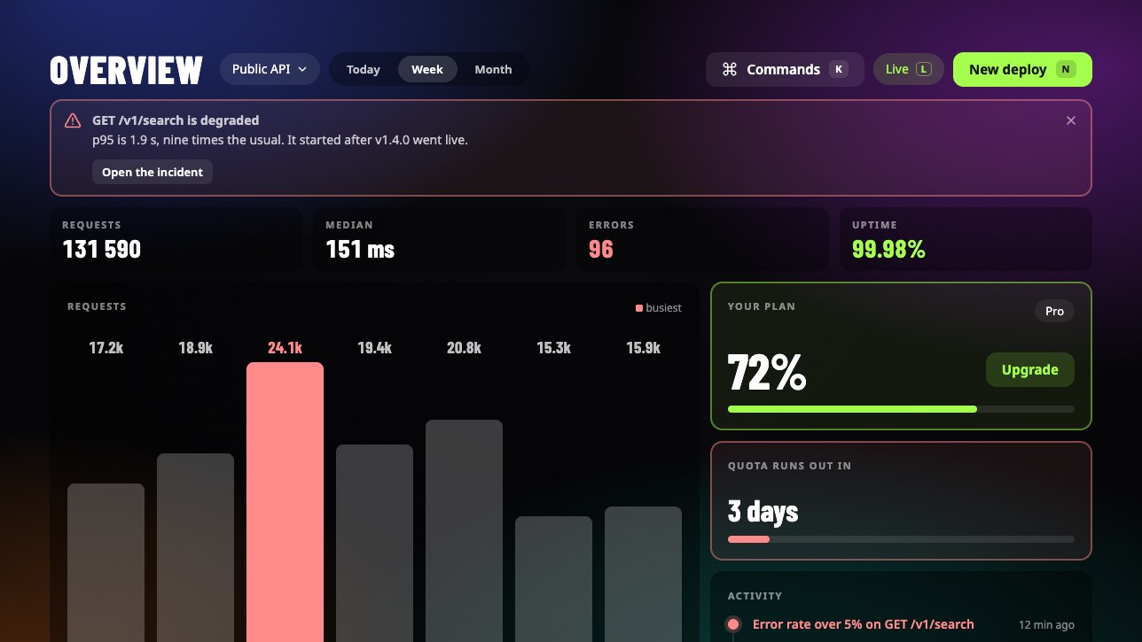
Dashboard
An API overview: numbers that load, a chart, an alert, an activity feed, a deploy dialog, and a command palette on K.
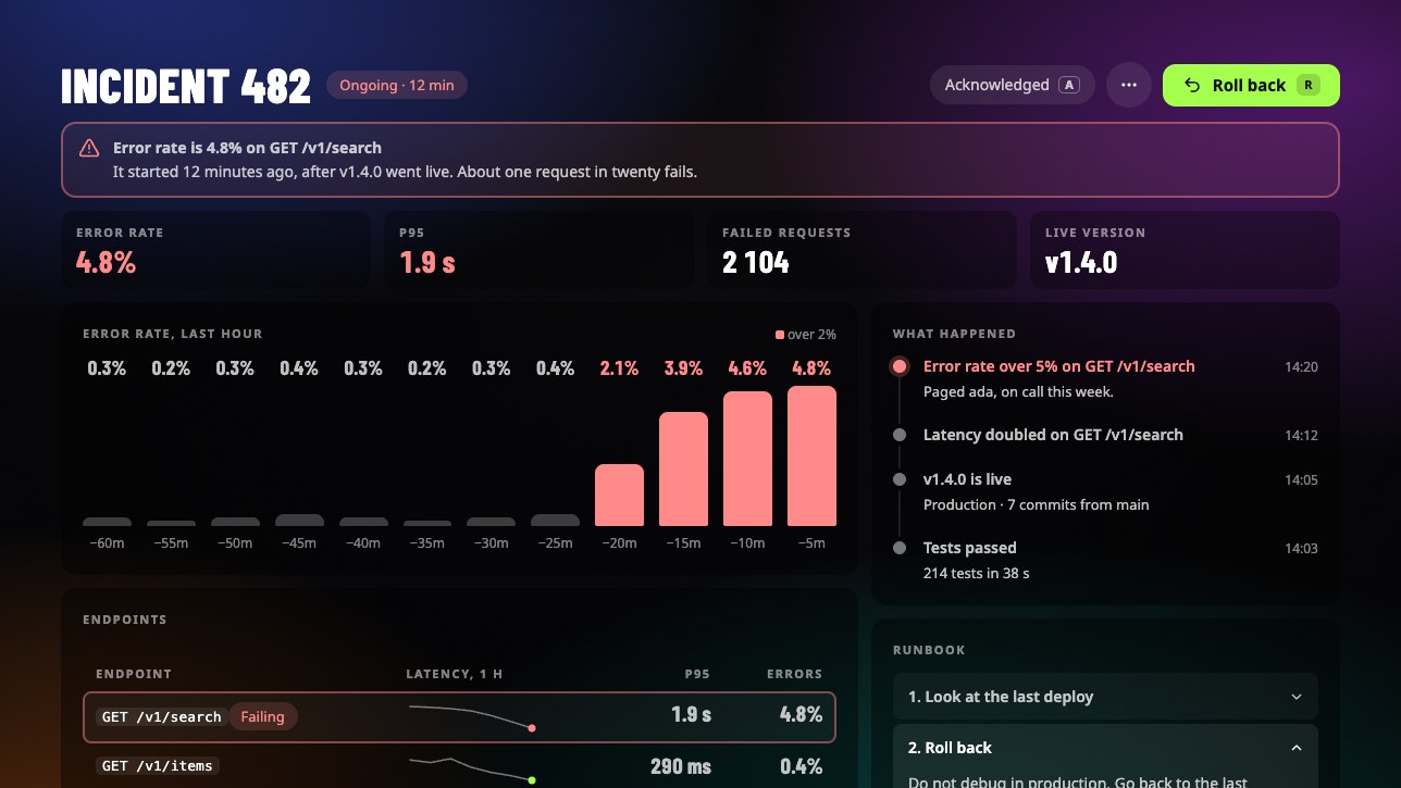
Incident
Something is at stake. Danger tells one story in five places, a runbook says what to do, and a rollback turns the page calm.
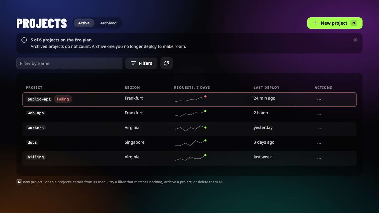
Projects
A list and all its states: loading, filtered to nothing, empty, with a menu on every row and the details of a project in a drawer.
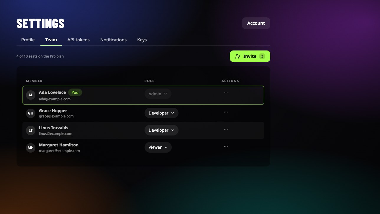
Settings
Five tabs: a form that knows it is unsaved, a team, API tokens shown once, notifications with a threshold, key bindings.
The look
Glass, not boxes
A card is a translucent dark fill over the background. No neutral borders.
A ring is a signal
An outline appears only when it means something: the main thing, or something at stake.
One accent
A single bright accent on a dark stage. Everything else is white at different opacities.
Two typefaces
A condensed display face for numbers and headings, a plain sans for text.
Light, not motion
Feedback under 300 ms, nothing bounces. Reduced motion turns it all off.
Keyboard first
A button can show and own its hotkey, read from the physical key.